您现在的位置是:网站首页> 编程资料编程资料
用纯css3和html制作泡沫对话框实现代码CSS3软件卸载对话框代码 根据是否卸载出现不同表情CSS实现对话框小尾巴功能纯CSS实现气泡对话框尖角处理方案纯CSS代码实现各类气球泡泡对话框效果css 实现小尖角聊天对话框带尖角的说话泡泡效果
 2021-09-07
852人已围观
2021-09-07
852人已围观
简介 泡沫对话框是一种比较流行的趋势因为它改变了传统,通常情况下都是使用html和javascript或者是图片来实现,接下来为大家介绍下使用css3配合html来实现一些简单的泡沫对话框
现在,泡沫对话框是一种比较流行的趋势,一般都是用html和javascript,和或者图片来实现,今天用纯css3和html来实现一些基本的简单的泡沫对话框
html代码如下:
复制代码
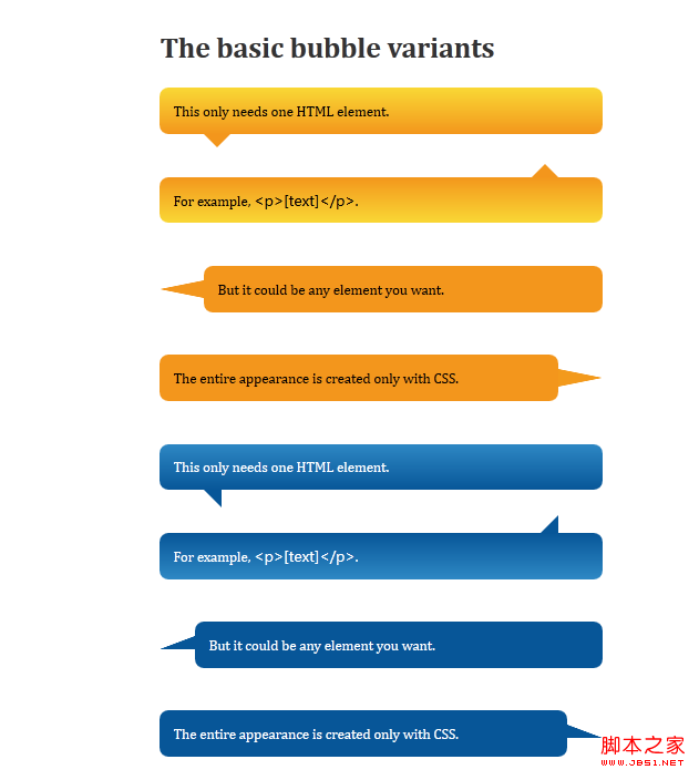
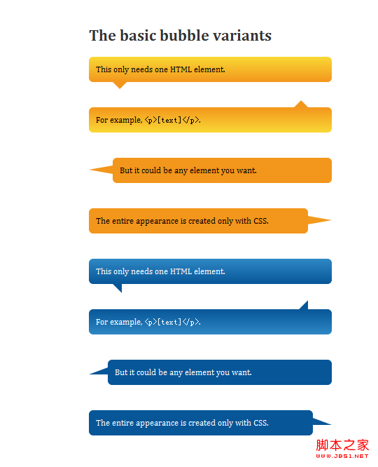
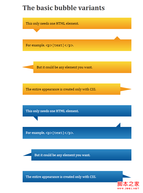
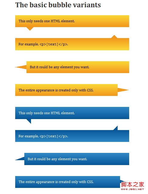
代码如下:The basic bubble variants
This only needs one HTML element.
For example, [text]
But it could be any element you want.
The entire appearance is created only with CSS.
This only needs one HTML element.
For example, [text]
But it could be any element you want.
The entire appearance is created only with CSS.
css代码如下:
复制代码
代码如下:body {
padding:0;
margin:0;
font:1em/1.4 Cambria, Georgia, sans-serif;
color:#333;
background:#fff;
}
a:link, a:visited {
border-bottom:1px solid #c55500;
text-decoration:none;
color:#c55500;
}
a:visited {
border-bottom:1px solid #730800;
color:#730800;
}
a:hover, a:focus, a:active {
border:0;
color:#fff;
background:#c55500;
}
a:visited:hover, a:visited:focus, a:visited:active {
color:#fff;
background:#730800;
}
h2 {
margin:0.5em 0 1.5em;
font-size:1.25em;
font-weight:normal;
font-style:italic;
text-align:center;
}
p {
margin:1em 0;
}
.content h2 {
margin:2em 0 0.75em;
font-size:2em;
font-weight:bold;
font-style:normal;
text-align:left;
}
.content {
width:500px;
padding:0 0 50px;
margin:0 auto;
position:relative;
z-index:1;
}
.triangle-isosceles {
position:relative;
padding:15px;
margin:1em 0 3em;
color:#000;
background:#f3961c;
background:-webkit-gradient(linear, 0 0, 0 100%, from(#f9d835), to(#f3961c));
background:-moz-linear-gradient(#f9d835, #f3961c);
background:-o-linear-gradient(#f9d835, #f3961c);
background:linear-gradient(#f9d835, #f3961c);
filter:progid:DXImageTransform.Microsoft.gradient(GradinetType=0, startColorstr="#f9d835", endColorstr="#f3961c");
-webkit-border-radius:10px;
-moz-border-radius:10px;
border-radius:10px;
}
.triangle-isosceles.top {
background:-webkit-gradient(linear, 0 0, 0 100%, from(#f3961c), to(#f9d835));
background:-moz-linear-gradient(#f3961c, #f9d835);
background:-o-linear-gradient(#f3961c, #f9d835);
background:linear-gradient(#f3961c, #f9d835);
filter:progid:DXImageTransform.Microsoft.gradient(GradientType=0, startColorstr="#f3961c", endColorstr="#f9d835");
}
.triangle-isosceles.left {
margin-left:50px;
background:#f3961c;
}
.triangle-isosceles.right {
margin-right:50px;
background:#f3961c;
}
.triangle-isosceles:after {
content:"";
position:absolute;
left:50px;
bottom:-15px;
border-width:15px 15px 0;
border-style:solid;
border-color:#f3961c transparent;
display:block;
width:0;
}
.triangle-isosceles.top:after {
top:-15px;
bottom:auto;
left:auto;
right:50px;
border-width:0 15px 15px;
border-color:#f3961c transparent;
}
.triangle-isosceles.left:after {
top:16px;
left:-50px;
bottom:auto;
border-width:10px 50px 10px 0;
border-color:transparent #f3961c;
}
.triangle-isosceles.right:after {
top:16px;
right:-50px;
bottom:auto;
border-width:10px 0 10px 50px;
border-color:transparent #f39a1c;
left:auto;
}
.triangle-right {
position:relative;
padding:15px;
margin:1em 0 3em;
color:#fff;
background:#075698;
background:-webkit-gradient(linear, 0 0, 0 100%, from(#2e88c4), to(#075698));
background:-moz-linear-gradient(#2e88c4, #075698);
background:-o-linear-gradient(#2e88c4, #075698);
background:-ms-linear-gradient(#2e88c4, #075698);
filter:progid:DXImageTransform.Microsoft.gradient(GradientType=0, startColorstr="#2e88c4", endColorstr="#075698");
-webkit-border-radius:10px;
-moz-border-radius:10px;
border-radius:10px;
}
.triangle-right.top {
background:-webkit-gradient(linear, 0 0, 0 100%, from(#075698), to(#2e88c4));
background:-moz-linear-gradient(#075698, #2e88c4);
background:-o-linear-gradient(#075698, #2e88c4);
background:linear-gradient(#075698, #2e88c4);
filter:progid:DXImageTransform.Microsoft.gradient(GradientType=0, startColorstr="#075698", endColorstr="#2e88c4");
}
.triangle-right.left {
margin-left:40px;
background:#075698;
}
.triangle-right.right {
margin-right:40px;
background:#075698;
}
.triangle-right:after {
content:"";
position:absolute;
bottom:-20px;
left:50px;
border-width:20px 0 0 20px;
border-style:solid;
border-color:#075698 transparent;
display:block;
width:0;
height:0;
}
.triangle-right.left:after {
top:16px;
left:-40px;
bottom:auto;
border-width:15px 40px 0 0;
border-color:transparent #075698;
}
.triangle-right.top:after {
top:-20px;
right:50px;
bottom:auto;
left:auto;
right:50px;
border-width:20px 20px 0 0;
border-color:transparent #075698;
}
.triangle-right.right:after {
top:16px;
right:-40px;
bottom:auto;
left:auto;
border-width:15px 0 0px 40px;
border-color:transparent #075698;
}
支持的浏览器有:Firefox 3.5+, Safari 4+, Chrome 4+, Opera 10+, IE8+.
预览效果如下:
在firefox14.0中预览的效果:
在chrome10.0中预览效果
在ie9中预览效果:
在ie8中预览的效果:
相关内容
- 设计一个带选择和提示功能的检索框(分步介绍)设置div背景透明的方法示例CSS实现div不设高度完全居中div自适应高度自动填充剩余高度详解DIV+CSS的命名规矩才能有利于SEO优化的实现方法DIV或者DIV里面的图片水平与垂直居中的方法详解如何用div实现自制滚动条div对齐与网页布局详解DIV+CSS实现电台列表设计的示例代码div+css实现带箭头的面包屑导航栏不定宽高的文字在div中垂直居中实现方法
- css控制文字前的小图标具体写法css图标与文字对齐的两种实现方法Html+css实现纯文字和带图标的按钮纯CSS实现取字符串的第一个字符实现文字图标功能
- a和span组合定义按钮样式实例分享设置div背景透明的方法示例CSS实现div不设高度完全居中div自适应高度自动填充剩余高度详解DIV+CSS的命名规矩才能有利于SEO优化的实现方法DIV或者DIV里面的图片水平与垂直居中的方法详解如何用div实现自制滚动条div对齐与网页布局详解DIV+CSS实现电台列表设计的示例代码div+css实现带箭头的面包屑导航栏不定宽高的文字在div中垂直居中实现方法
- IE中css样式设置height无效的解决方法浅谈原生页面兼容IE9问题的解决方案新版chrome浏览器设置允许跨域的实现css hack之\9和\0就可能对hack IE11\IE9\IE8无效css区分ie8/ie9/ie10/ie11 chrome firefox的代码解决CSS浏览器兼容性问题的4种方案常见的浏览器兼容性问题(小结)border-radius IE8兼容处理的方法浅谈遇到的几个浏览器兼容性问题base64图片在各种浏览器的兼容性处理 对常见的css属性进行浏览器兼容性总结(推荐)
- 固定浮动定位(fixed)实现思路及代码CSS Transition通过改变Height实现展开收起元素从QQtabBar看css命名规范BEM的详细介绍css实现两栏布局,左侧固定宽,右侧自适应的多种方法CSS 实现Chrome标签栏的技巧CSS实现两列布局的N种方法CSS实现隐藏搜索框功能(动画正反向序列)CSS3中Animation实现简单的手指点击动画的示例详解CSS中的特指度和层叠问题详解overflow:hidden的作用(溢出隐藏、清除浮动、解决外边距塌陷)关于CSS浮动与取消浮动的问题
- css3一款3D字体带阴影效果的实现步骤详解CSS3中字体平滑处理和抗锯齿渲染CSS3字体效果的设置方法小结轻松掌握CSS3中的字体大小单位rem的使用方法使用CSS3的font-face字体嵌入样式的方法讲解CSS3 text shadow字体阴影效果 一款纯css3实现的颜色渐变按钮的代码教程css3 自定义字体font-face使用介绍CSS3用@font-face实现自定义英文字体CSS3+font字体文件实现圆形半透明菜单具体步骤(图解)CSS3教程(7):CSS3嵌入字体
- css3 iphone玻璃透明气泡完美实现CSS3 仿微信聊天小气泡实例代码HTML5-WebSocket实现聊天室示例HTML5仿手机微信聊天界面纯CSS实现聊天框小尖角、气泡效果利用html5的websocket实现websocket聊天室纯CSS实现右侧底部悬浮效果(悬浮QQ、微信、微博、邮箱等联系方式)如何弹出QQ临时对话框实现不添加好友在线交谈效果CSS3制作气泡对话框的实例教程可自定义箭头样式的CSS3气泡提示框利用CSS3实现气泡效果的教程
- css3实现一款模仿iphone样式的注册表单CSS3模拟iPhone4界面 滑动解锁代码下载纯CSS3制作iphone 6手机模型特效源码用CSS3写的模仿iPhone中的返回按钮纯CSS3实现的iPhone样式的3D菜单特效源码 纯CSS3实现3D效果iPhone6手机外观动画特效源码CSS3 重置iphone浏览器按钮input,select等表单元素的默认样式CSS3模仿苹果iphone的搜索框聚焦变长效果css3 iphone玻璃透明气泡完美实现CSS3实现iPhone滑动解锁功能代码
- css3打造一款漂亮的卡哇伊按钮css3中transform属性实现的4种功能详解CSS3.0(Cascading Style Sheet) 层叠级联样式表纯CSS3实现div按照顺序出入效果CSS3实现列表无限滚动/轮播效果css3 利用transform-origin 实现圆点分布在大圆上布局及旋转特效CSS3实现的侧滑菜单CSS3实现的3D隧道效果用CSS3画一个爱心css3 实现文字闪烁效果的三种方式示例代码六种css3实现的边框过渡效果
- 父元素与子元素之间的margin-top问题(css hack)css中子元素设置margin-top为什么影响了父元素CSS 同级元素position:fixed和margin-top共同使用的问题margin-top塌陷问题的现象与解决的具体方法margin-top负值解决label 文字与input 垂直居中对齐问题子元素margin-top导致父元素移动的问题解决