您现在的位置是:网站首页> 编程资料编程资料
纯CSS绘制三角形(各种角度)_基础教程_
 2023-05-25
214人已围观
2023-05-25
214人已围观
简介 纯CSS绘制三角形(各种角度)_基础教程_
我们的网页因为 CSS 而呈现千变万化的风格。这一看似简单的样式语言在使用中非常灵活,只要你发挥创意就能实现很多比人想象不到的效果。特别是随着 CSS3 的广泛使用,更多新奇的 CSS 作品涌现出来。
今天给大家带来 CSS 三角形绘制方法

#triangle-up {
width: 0;
height: 0;
border-left: 50px solid transparent;
border-right: 50px solid transparent;
border-bottom: 100px solid red;
}
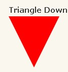
#triangle-down {
width: 0;
height: 0;
border-left: 50px solid transparent;
border-right: 50px solid transparent;
border-top: 100px solid red;
}
#triangle-left {
width: 0;
height: 0;
border-top: 50px solid transparent;
border-right: 100px solid red;
border-bottom: 50px solid transparent;
}
#triangle-right {
width: 0;
height: 0;
border-top: 50px solid transparent;
border-left: 100px solid red;
border-bottom: 50px solid transparent;
}
#triangle-topleft {
width: 0;
height: 0;
border-top: 100px solid red;
border-right: 100px solid transparent;
}
#triangle-topright {
width: 0;
height: 0;
border-top: 100px solid red;
border-left: 100px solid transparent;
}
#triangle-bottomleft {
width: 0;
height: 0;
border-bottom: 100px solid red;
border-right: 100px solid transparent;
}
#triangle-bottomright {
width: 0;
height: 0;
border-bottom: 100px solid red;
border-left: 100px solid transparent;
}
今天给大家带来 CSS 三角形绘制方法

复制代码 代码如下:
#triangle-up {
width: 0;
height: 0;
border-left: 50px solid transparent;
border-right: 50px solid transparent;
border-bottom: 100px solid red;
}
复制代码 代码如下:
#triangle-down {
width: 0;
height: 0;
border-left: 50px solid transparent;
border-right: 50px solid transparent;
border-top: 100px solid red;
}

复制代码 代码如下:
#triangle-left {
width: 0;
height: 0;
border-top: 50px solid transparent;
border-right: 100px solid red;
border-bottom: 50px solid transparent;
}

复制代码 代码如下:
#triangle-right {
width: 0;
height: 0;
border-top: 50px solid transparent;
border-left: 100px solid red;
border-bottom: 50px solid transparent;
}

复制代码 代码如下:
#triangle-topleft {
width: 0;
height: 0;
border-top: 100px solid red;
border-right: 100px solid transparent;
}

复制代码 代码如下:
#triangle-topright {
width: 0;
height: 0;
border-top: 100px solid red;
border-left: 100px solid transparent;
}

复制代码 代码如下:
#triangle-bottomleft {
width: 0;
height: 0;
border-bottom: 100px solid red;
border-right: 100px solid transparent;
}

复制代码 代码如下:
#triangle-bottomright {
width: 0;
height: 0;
border-bottom: 100px solid red;
border-left: 100px solid transparent;
}
您可能感兴趣的文章:
相关内容
- css实现气泡框效果(实例加图解)_CSS/HTML_
- html的基本使用(HTML标签解释)_CSS/HTML_
- HTML5 WebStorage(HTML5本地存储技术)_CSS/HTML_
- 浅谈href=#与href=javascript:void(0)的区别_经验交流_
- javascript代码规范小结_基础教程_
- Zen Coding css,html缩写替换大观 快速写出html,css_经验交流_
- Zen Coding 快速编写HTML/CSS代码的实现_经验交流_
- 了解CSS的查找匹配原理,让CSS更简洁、高效_经验交流_
- firefox下rowspan+border+border-collapse的bug_经验交流_
- CSS的inherit与auto使用分析_经验交流_